
🎨 How to Choose the Perfect Color Palette for Your Home (Without Overthinking It!)
Choosing the right colors for your space sounds easy—until you’re standing in front of dozens of paint samples with names like “Sunset Beige” and “Whispering Fog,” and you realize: How do I know which palette actually works for my home? If you’ve ever felt that way, you’re not alone. But here’s the good news: picking the perfect color palette is totally doable with a few practical (and stylish!) tips. Let’s break it down, step by step—so you can feel confident in your choices and love your space even more.
5/3/20252 min read
🌈 Why Choosing the Right Color Palette Matters
Colors do more than just look good—they affect how we feel, how we move through a space, and even how big or cozy a room seems.
A smart palette:
Creates visual harmony between rooms
Helps guide furniture and decor choices
Avoids random, impulse purchases that clash with the vibe
In short, a well-chosen palette is the foundation of beautiful, intentional decor.
🧭 Step-by-Step: How to Choose Your Ideal Palette
1. Define Your Style and the Mood You Want
Start with the feeling: What kind of atmosphere do you want to create?
Neutrals = calm, cozy, timeless
Warm tones = inviting, energizing
Cool tones = relaxing, refreshing, sophisticated
✨ Tip: Look at styles you love (Scandi, boho, minimal, rustic) and notice which colors they often feature.
2. Consider the Lighting in the Room
Lighting—natural or artificial—has a huge impact on how colors appear.
A color that looks great in the store might feel totally different at home.
💡 Bright, naturally lit rooms can handle deeper or bolder colors.
Dim rooms tend to do better with lighter, airier tones.
Warm lighting makes colors appear more yellowish, while cool lighting can emphasize blues and greys.
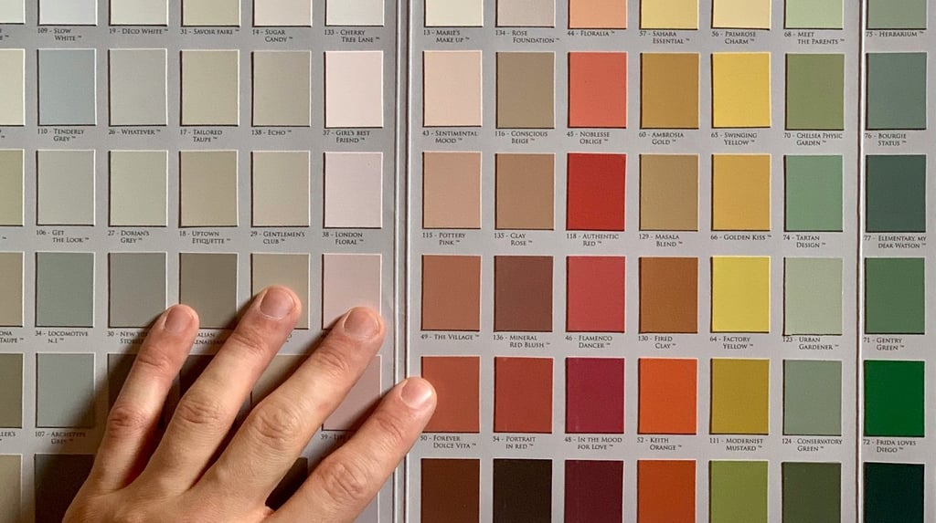
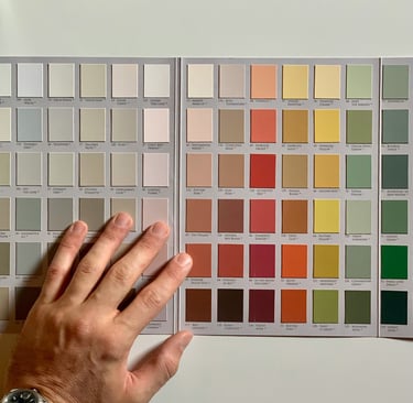
3. Choose a Base Color and Build Around It
Now that you’ve got a vibe in mind, pick one main/base color (usually for the walls) and then choose secondary and accent shades to go with it.
Use the color wheel as your best friend:
Monochromatic palette: various tones of the same color (e.g. soft blue + navy)
Analogous palette: colors next to each other on the wheel (e.g. green + blue + teal)
Complementary palette: opposite colors (e.g. blue + orange)
✨ Need help? Try free tools like Coolors or Adobe Color to build a perfect palette visually.
4. Follow the 60/30/10 Rule for Balance
This simple formula keeps things harmonious and easy on the eyes:
60% — dominant color (usually walls)
30% — secondary color (furniture, rugs)
10% — accent color (pillows, artwork, decor)
This rule works like magic to distribute colors in a way that feels balanced and professional.
5. Test Before You Commit!
Before painting an entire wall or buying that bright yellow armchair, test your colors first:
Paint a small section of the wall with samples
Create a moodboard with fabric swatches and photos
Use room simulator apps to visualize the palette in your space
✨ Bonus tip: Observe the test colors at different times of day to see how they change with the light.
🛋️ How to Apply Your Color Palette in Real Life
Once your palette is ready, it’s time to bring it to life.
Walls
The most impactful surface in any room. Use your dominant color here—or create an accent wall with a bolder shade.
Furniture
Introduce secondary colors through large furniture pieces like sofas, armchairs or sideboards. Think navy couches, natural wood tables, or sage green cabinetry.
Textiles & Decor
Accent colors shine in pillows, rugs, curtains, vases, and art. The best part? They’re easy to update later if you ever want a refresh.
🏁 Final Thoughts: Right Colors, Right Vibes
Choosing your color palette isn’t about rules—it’s about telling your story through your space.
When in doubt:
Keep it simple
Follow the mood you want to feel
Focus on balance, not perfection
You don’t need a degree in design to create a beautiful, cohesive space. You just need a plan—and now, you have one!
💬 And if you found this helpful, share it with a friend who’s also decorating their space. Let’s bring more color (and joy) into every home!
© 2025 Dhomehub. All rights reserved.